A World Perspective

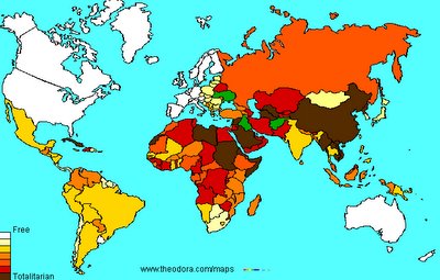
I colored in this map in July of '05 based on information from Freedom House. The countries are colored according to their degree of Freedom. This was based '04 information so it is a year out of date but there are a few things to note.
Colors are
White: Almost Completely Free
Lt. Yellow: Mostly Free
Yellow: Partly Free
Lt Orange: Marginally Free
Dark Orange: Very Limited Freedom
Red: Mostly Unfree
Brown: Almost Completely Unfree
Green: Situation in Change or Unratable.
I could not help noticing that the greatest freedom is located in North America, Western Europe, Austrailia and New Zealand. The only nearly completely free (no country rates total freedom) that does not fit this description is Uraguay (while Japan, Israel, and South Africa also do very well.)
I also notice that, except for a few bright spots, Africa and Asia are in sad shape indeed while the only truly dark spots on North America are Cuba and Haiti.
In the Islamic nations, only Turkey and Indonesia rate a "Marginally Free" while most are "Mostly Unfree" or "Totally Unfree".
You must remember that this map and Freedom House give things relative to the world at large and not merely American standards. This map is also not a map of political alliances and some countries are unfree for various reasons. I just thought I would share this.


4 Comments:
Sheeesh .. it almost looks like a game of "Risk" .. divide and conquer.
I enjoyed that. Thanks.
Very cool of you to do that, because it looks like a bit of work! Thanks. :)
Wow!!!!!!! This is an awesome find!! Great info, I may have to snag this from you in the future.
Post a Comment
<< Home